Introduction 🌿✨
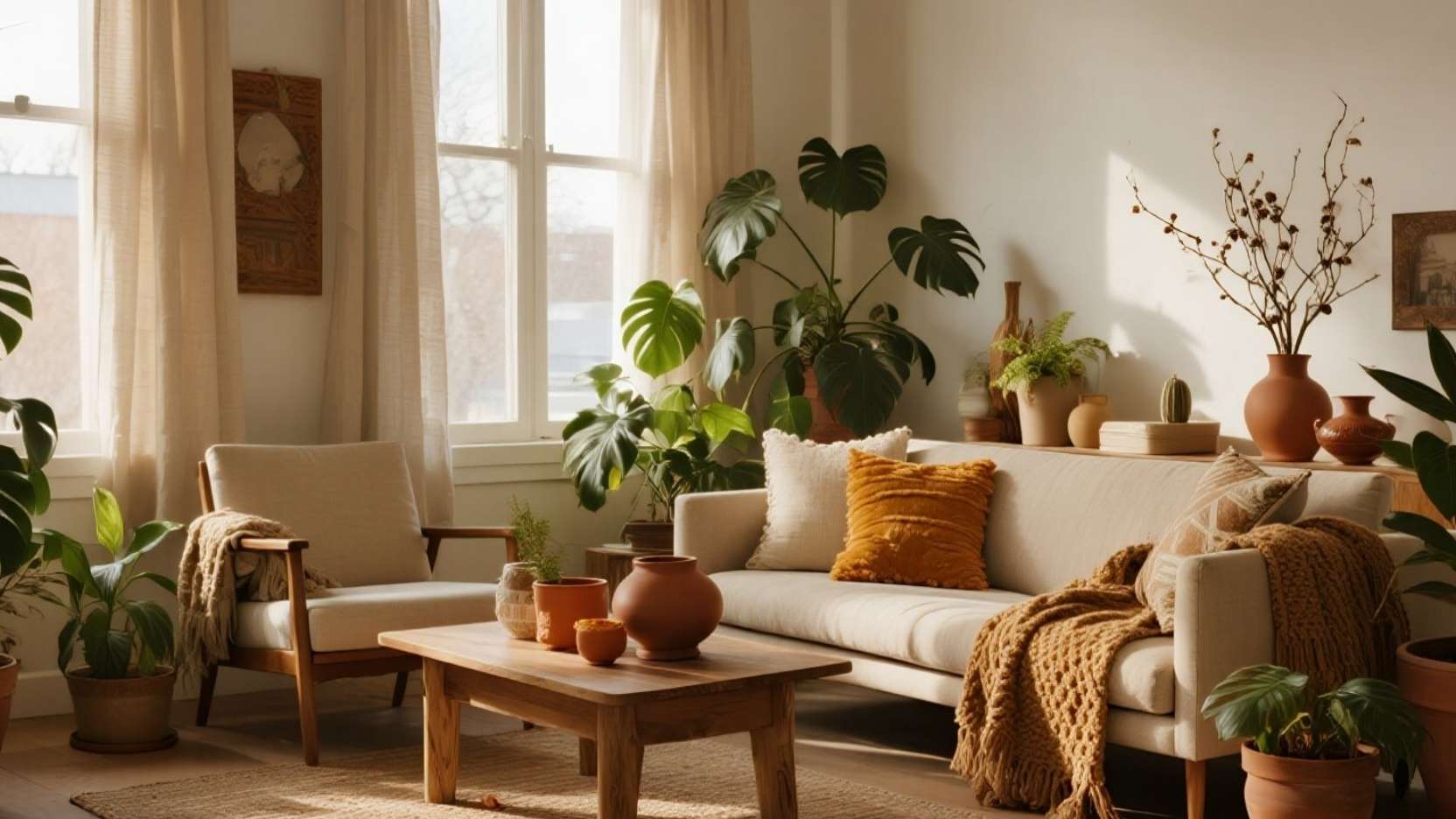
Spring is the perfect season to treat greenery as your room’s “neutral,” letting plants set the mood while everything else harmonizes around them. Think of foliage as your primary color layer, then echo its tones—sage, pistachio, fern—through textiles and ceramics for a calm, cohesive look. This approach feels fresh, trend-aligned, and budget-friendly because small styling swaps amplify the impact of every leaf. 🌱
When plants become the base palette, you gain a flexible canvas that evolves as your collection grows. Rotate varieties by light and season, and update throws or pillow covers to mirror new tones without a full redesign. The result is a space that looks styled by nature and maintained with intention. 🍃
Why “Greenery as the Neutral” Works 🌳🎨
Green behaves like denim in fashion—versatile, grounding, and easy to pair—so using foliage as your “neutral” organizes the whole room. When cushions, throws, and ceramics repeat the plant tones, the eye reads unity even with mixed textures. This trick calms visual noise and makes the room feel curated rather than crowded. ✅
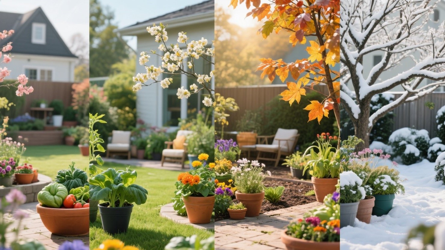
It’s also practical because plant hues naturally span cool to warm greens, giving you seasonal flexibility. Add butter yellow or blush accents in spring, then swap to terracotta or walnut in fall without changing the core palette. Your green base remains timeless while accents rotate with trends. ♻️

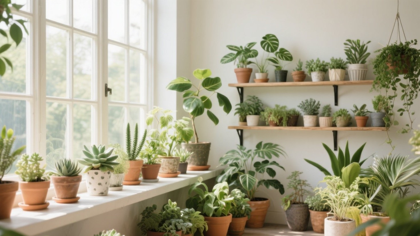
Map Plants to Light: A Mini Placement Guide 🧭☀️
Getting placement right prevents stress on plants and prevents “bald corners” that break the design. Use this simple map: north window = snake plant/ZZ; bright indirect = monstera/peperomia; sunny sill = succulents/herbs. Matching species to light creates healthier growth, better color, and fewer replacements. 🌞
Remember that “bright indirect” means abundant daylight without harsh sunbeams on leaves. East light is usually gentle; west can be hot—so pull monstera a bit back from west windows or filter with a sheer. If leaves scorch or pale, adjust distance before changing the plant. 🔧
Quick Pairings by Zone 🍀
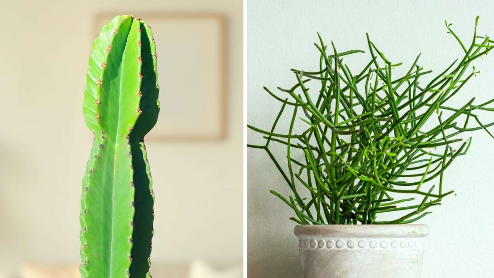
- Low light / North window: Snake plant (Sansevieria), ZZ (Zamioculcas), pothos; sturdy, architectural, slow-watering. These thrive on neglect and deliver strong silhouettes that read like living sculpture. Use them to anchor corners and balance tall furniture. 🧱
- Bright indirect / East or filtered West: Monstera deliciosa, peperomia, philodendron; fuller leaves and lush texture. Keep 0.5–1.5 m back from glass or behind a sheer to avoid scorch. Rotate monthly for even growth and a symmetrical profile. 🔄
- Direct sun / South or hot West sill: Succulents, rosemary, thyme, dwarf citrus; compact, sun-hungry, and fragrant. Group in low trays to manage runoff and keep silhouettes tidy. Feed lightly in spring for dense, photogenic growth. 🌼
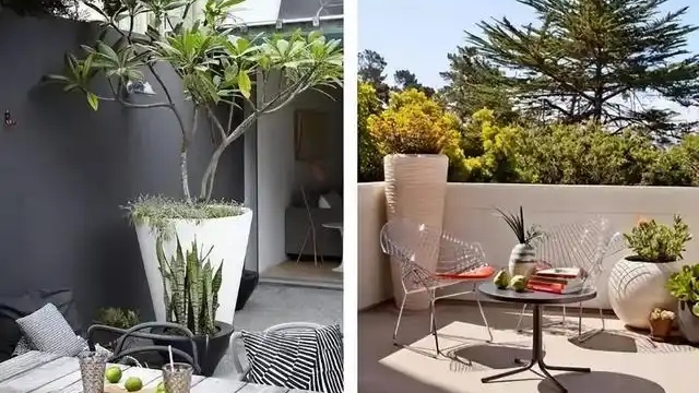
Palette Echo: Textiles & Ceramics that Mirror Foliage Tones 🧵🫙
Choose two greens as “anchors” (e.g., sage + pistachio) and repeat each at least twice: a throw + pillow, a mug + vase. Add one “contrast green” (fern) sparingly to create rhythm without chaos. This repetition reads cohesive on camera and in person. 📸
Balance textures so the room feels airy, not heavy. Pair nubby linen with smooth glazed cups, waffle throws with matte vases, and a jute rug with a fine-weave cushion. The mix keeps light dancing across surfaces, echoing how leaves catch and soften daylight. ✨

The “Pot Recipe” for a Cohesive Look 🏺👩🍳
Use this reliable 3-piece formula on any shelf: matte white + natural clay + one patterned piece. The white adds lightness, clay adds warmth, and a single pattern gives personality without clutter. Repeat the trio across zones to stitch the room together. 🧩
Scale matters: combine one tall cylinder (for vertical lift), one squat bowl (for trailing), and one medium footed pot (for variety). Keep saucers consistent—plain, low-profile—so the plants, not hardware, do the talking. This quiet consistency photographs cleanly and simplifies watering day. 💧

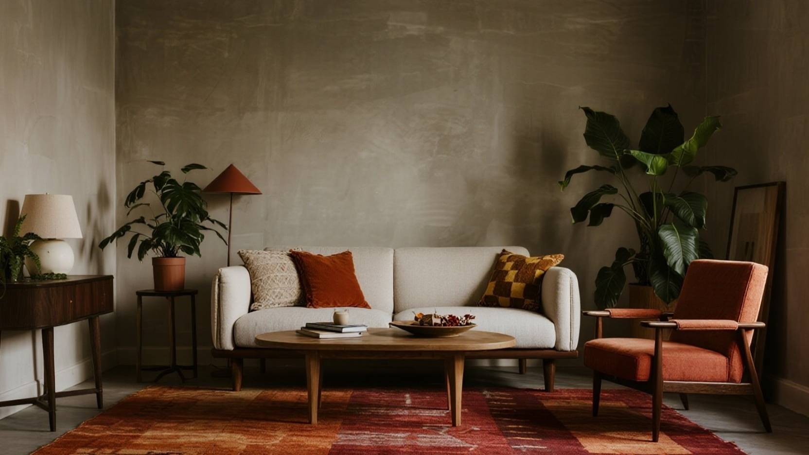
Layered Styling: Heights, Groupings, and Negative Space 📐🪴
Think in tiers—floor, seat, eye, above-eye—so greenery punctuates the entire vertical field. Use a floor palm or olive at ground, a stool plant at seat height, a console grouping at eye level, and a hanging or wall shelf above. This creates a gentle “green gradient” that feels immersive, not messy. 🌈
Group in odd numbers (3–5) and vary leaf shapes: one split (monstera), one round (peperomia), one strappy (snake plant). Leave breathing room around statement pieces like the fireplace or TV to avoid visual crowding. Negative space is your best styling tool—it makes each leaf read as intentional. 🖼️

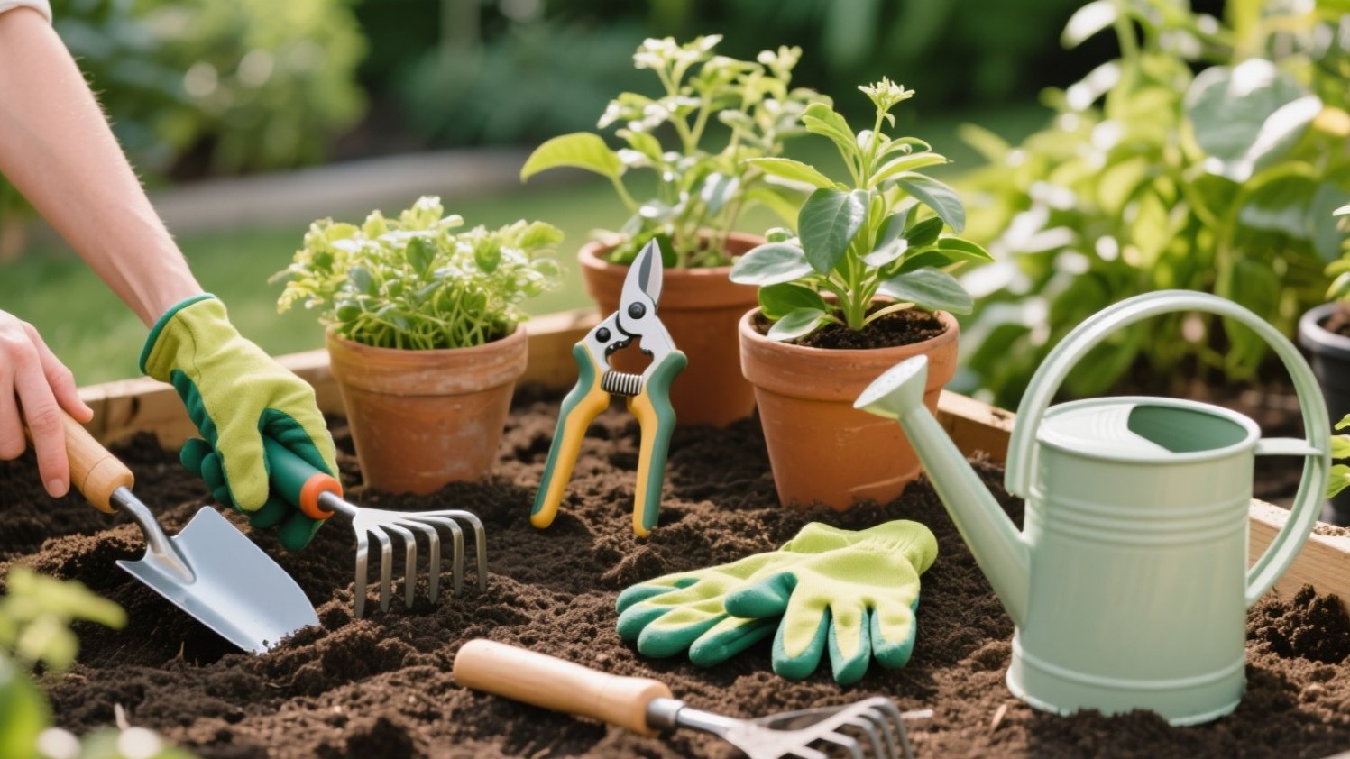
Spring Care: Easy Wins for Health & Color 🌧️🫧
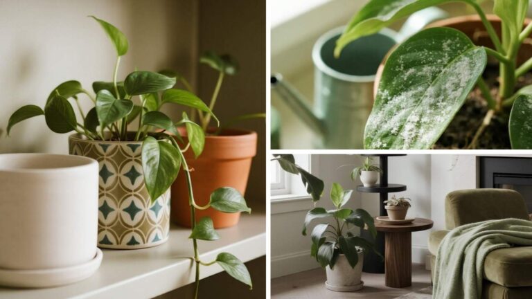
Refresh the canopy by dusting leaves with a damp microfiber; clean leaves reflect more light and look richer in photos. Shift to a soak-then-drain watering pattern: saturate, let excess run off, never leave roots sitting in water. Add a felt pad or tray liner to protect wood surfaces without showing in the design. 🪄
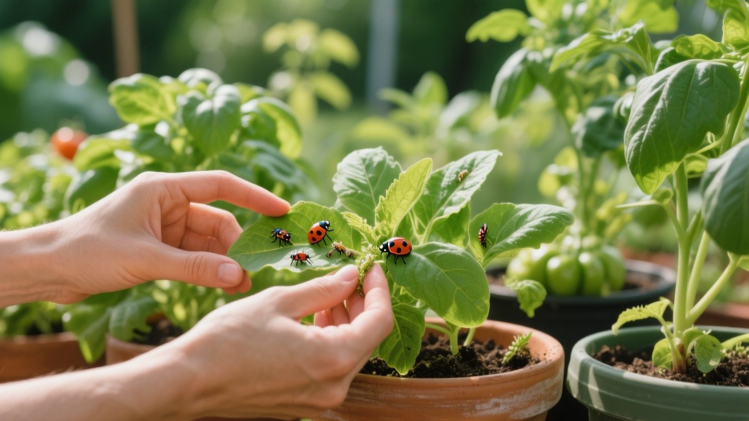
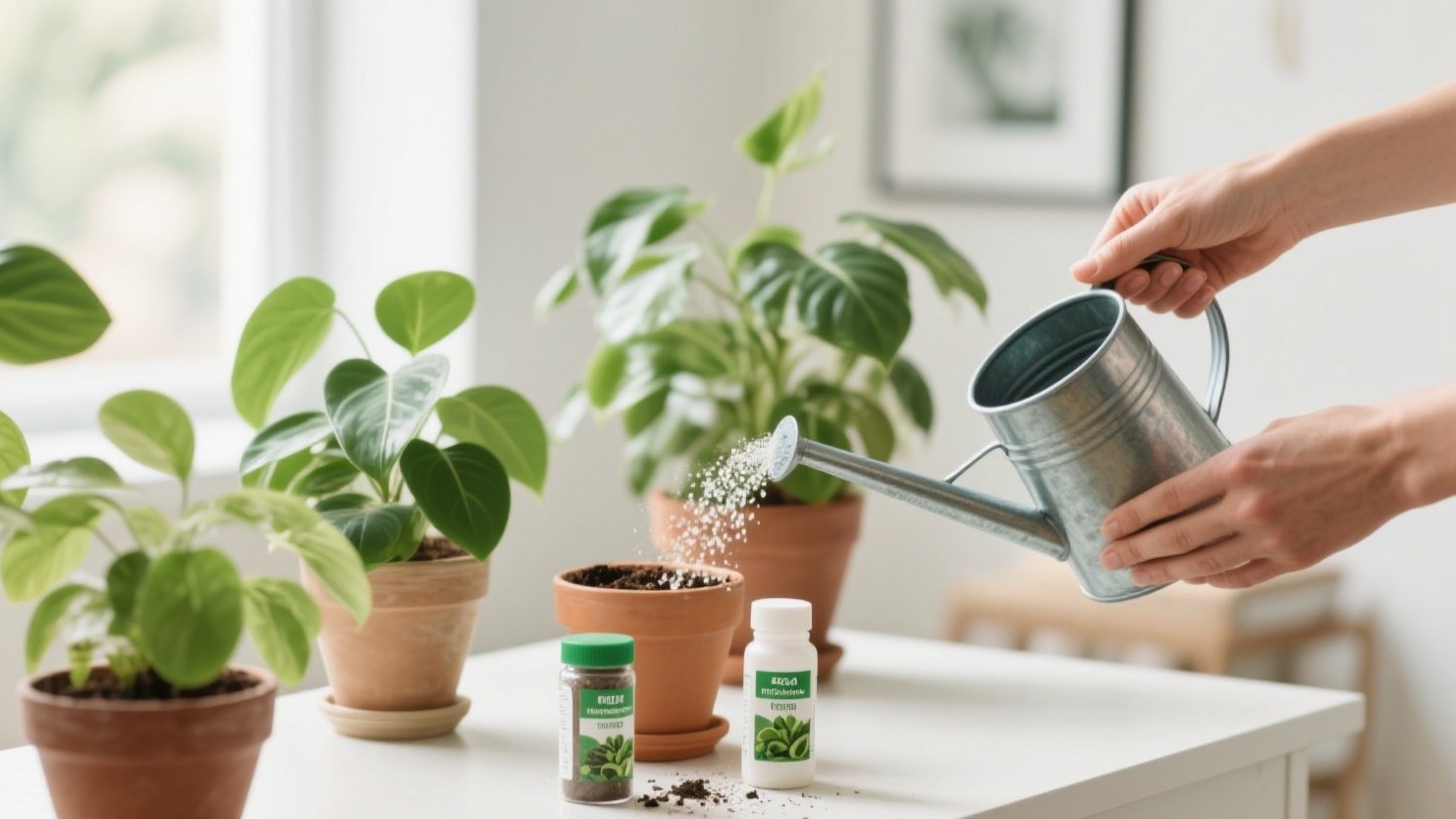
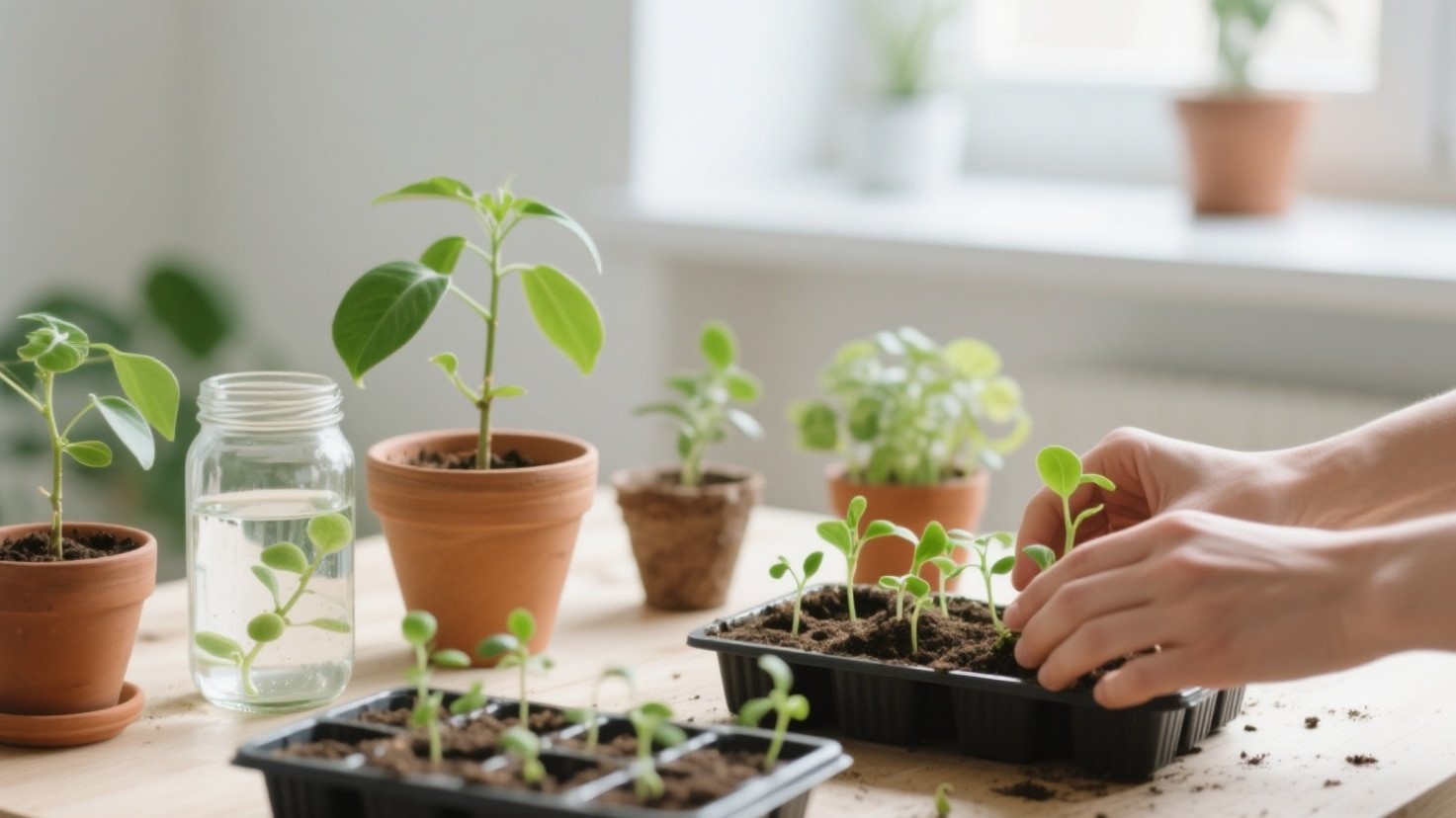
Feed lightly with a balanced fertilizer at half strength every 4–6 weeks in spring. Check roots when repotting: step up only one pot size to avoid soggy soil. Quarantine any new plants for a week to prevent hitchhiking pests from spreading to the main display. 🛡️

Room Recipe: Pull It All Together 📝🌼
- Map light → place plants accordingly
- Pick two anchor greens + one accent
- Apply the pot recipe across shelves
- Build vertical tiers
- Maintain with simple spring care.
These five steps keep the room harmonious even as your collection grows. Think of it as a capsule wardrobe—but for plants. 👗➡️🌿
Finish with one joyful accent—a pistachio-striped lumbar pillow or a patterned pot—to keep the look lively. Then step back and remove one item to preserve negative space. Your plant-forward spring living room will feel serene, photogenic, and genuinely you. 💚