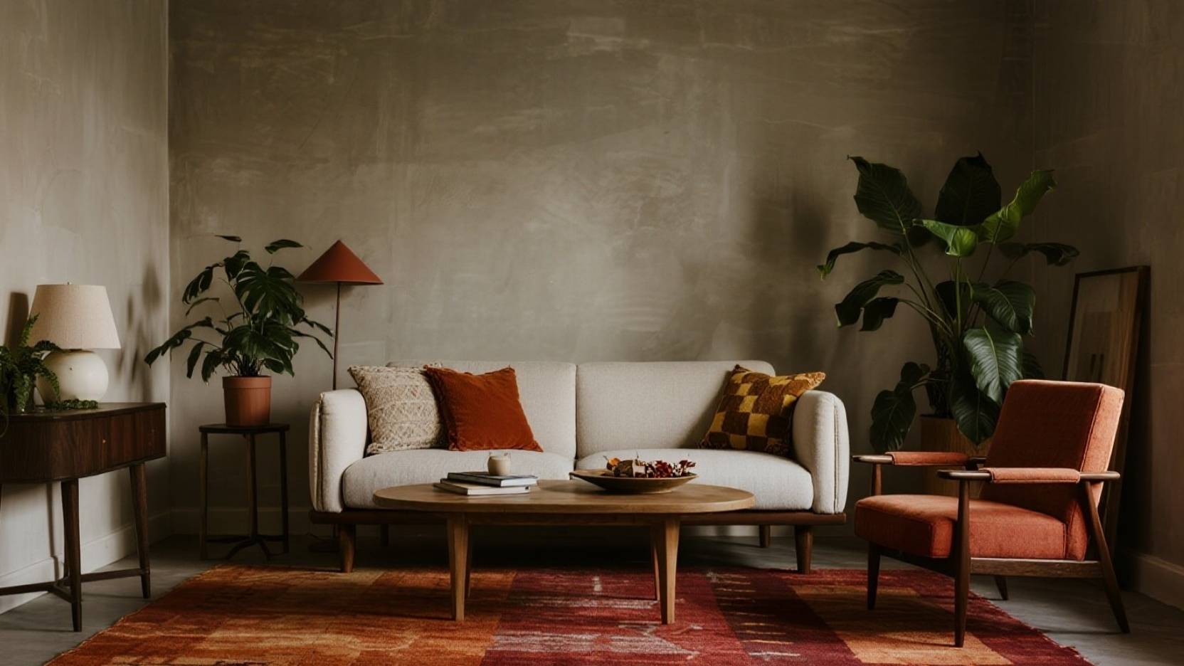
Why Sculptural Plants Feel Like “Cozy Drama” In Fall
Candelabra Euphorbia and Pencil Cactus bring height, sharp lines, and a modern silhouette that instantly makes a room feel styled—like adding a statement lamp, but alive. In fall, they look especially striking against warm neutrals like rust, clay, and caramel because the contrast reads “calm + bold” at the same time. The key is letting their shape do the talking while the rest of the space stays soft: warm light, textured fabrics, and a tight color palette. 🍂✨
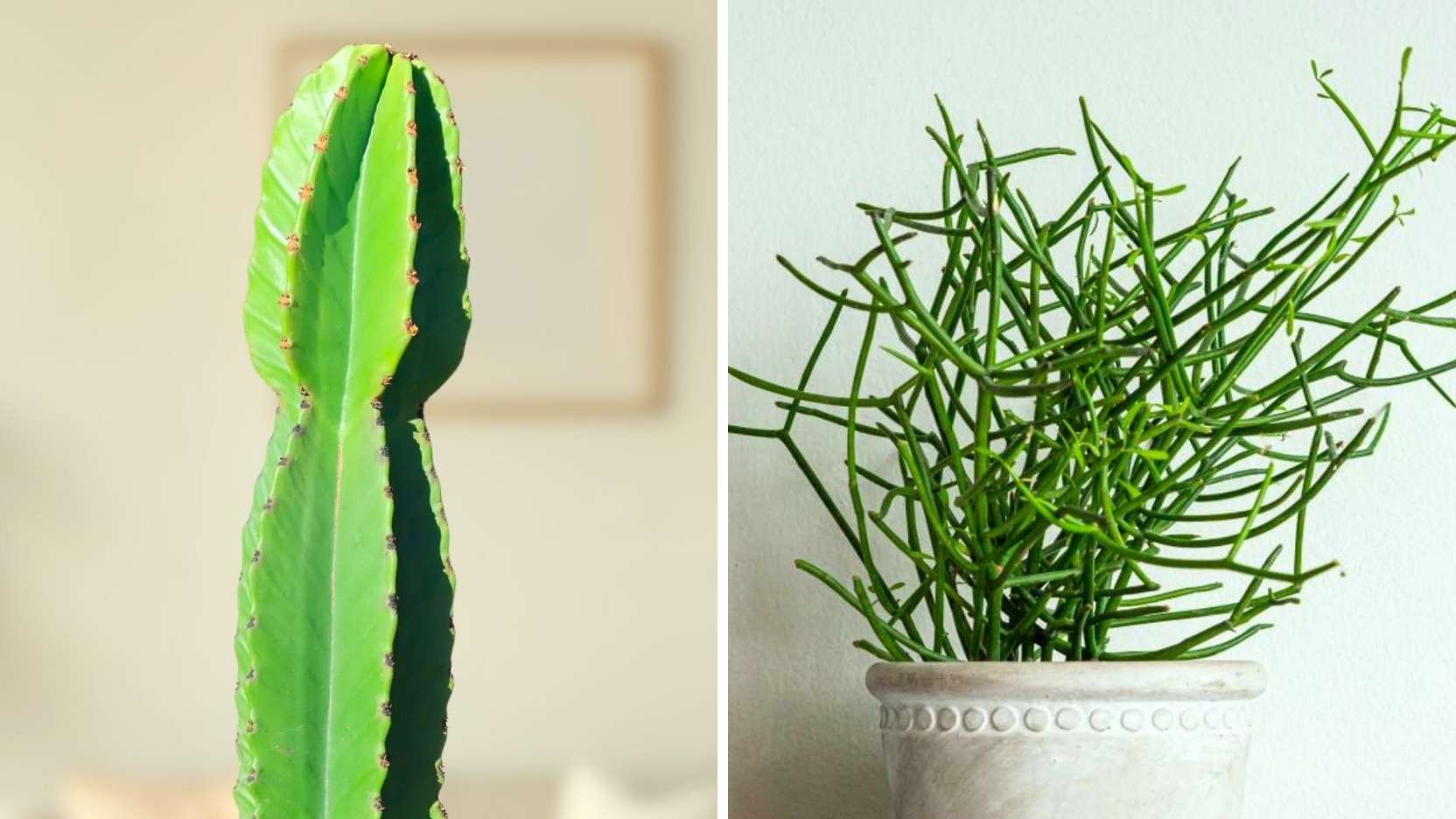
Candelabra Euphorbia: The Tall, Architectural Centerpiece
This plant works best when you treat it like a sculptural column—give it breathing room so the branching form feels intentional, not cramped. Place it near a bright window and rotate it occasionally for balanced growth, because leaning toward the light is common with tall silhouettes. Handle with care: Euphorbia sap is a milky latex that can irritate skin and eyes, so gloves and smart placement away from kids/pets are worth it. 🪴⚠️

Pencil Cactus: Minimalist Lines That Look Expensive
Pencil Cactus gives you that “designer home” vibe because the thin upright stems look like living brushstrokes—especially in a simple stone or matte pot. Keep it bright and let the soil dry well between waterings, since overwatering is the fastest way to lose that crisp, healthy look. If you want fuller drama, cluster it with low, rounded shapes (like a bowl planter or a soft ottoman) so the room has balanced geometry. 🌿🕯️

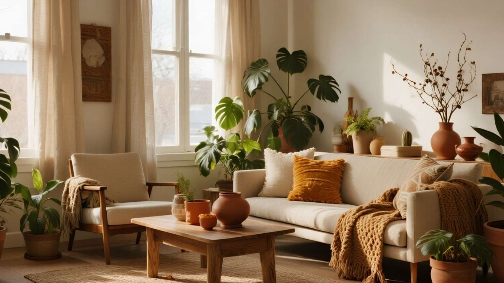
The Autumn Neutral Formula: Rust + Clay + Caramel (Without Looking “Theme-y”)
Autumn neutrals feel elevated when you repeat them in small doses—one rust textile, one clay ceramic piece, one caramel-toned wood element—so the room looks curated, not seasonal-costume. Keep the background quiet (cream, warm gray, sand) and let the greenery provide the “cool” note that stops the palette from becoming too orange. Think of it like seasoning: you want warmth you can feel, not warmth that shouts. 🧡🪵
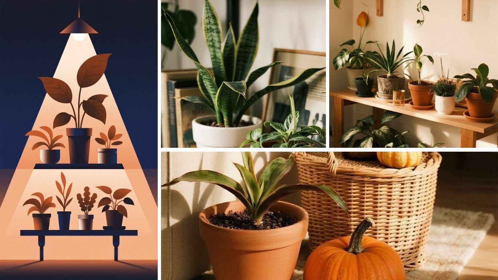
Repeat Pot Finishes to Make the Whole Room Feel Intentional
One of the easiest pro-level tricks is repeating pot finishes—like terracotta + stone—across multiple plants so the eye reads the space as “designed.” If your room already has mixed decor, use pots as the unifying “branding,” the same way a consistent font makes a website feel polished. Aim for two main pot families (example: warm terracotta and pale stone) and let everything else be a variation, not a new category. 🏺✅
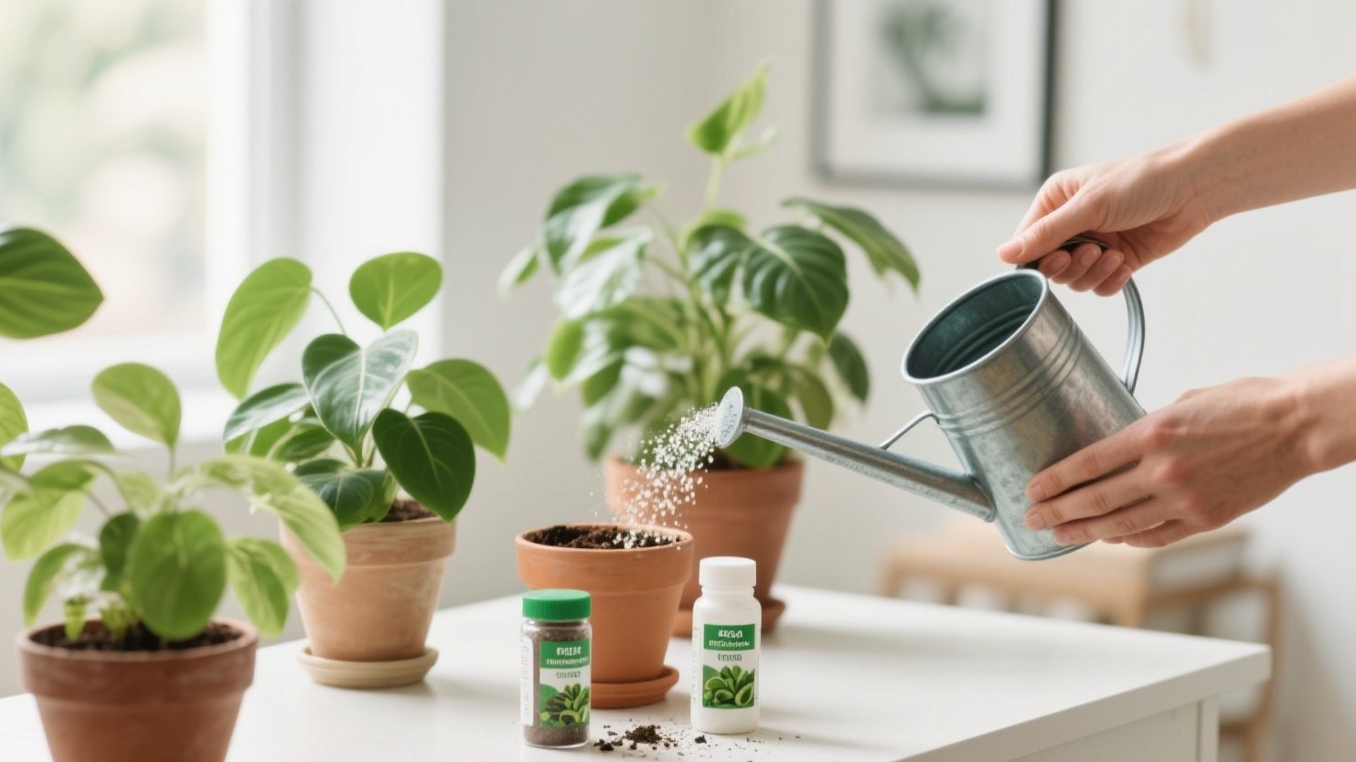
Final Touches: Safe Placement + Simple Care That Preserves the Look
If you’re styling these as “plant decor,” prioritize stable pots, bright placement, and enough space to prevent bumps—tall plants look best when they feel anchored. Water sparingly, avoid cold drafts, and wipe dust occasionally so the plants keep that crisp, sculptural silhouette. With warm neutrals, repeated pot materials, and one bold green focal point, you’ll get a room that feels cozy, modern, and effortlessly pulled together. 🍁✨