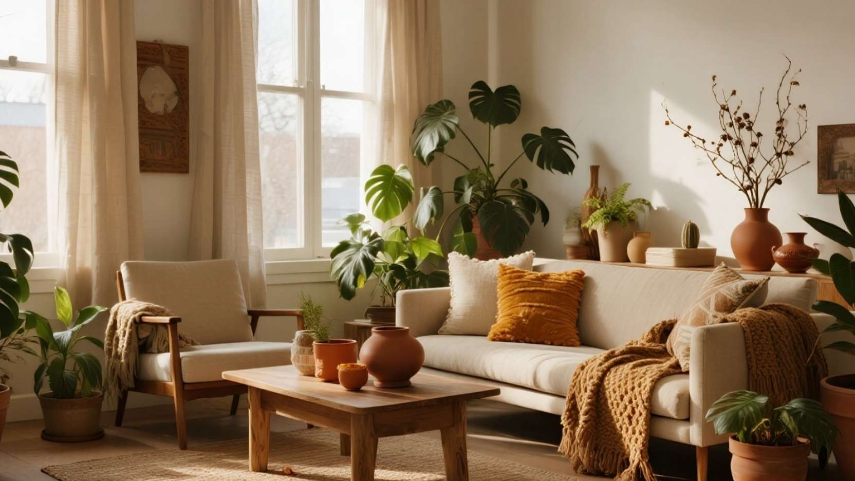
Warmth Without Renovation: The “Tone-Matching” Shortcut ✨
If your room feels a little cold or mismatched, you don’t need paint or new furniture—you need a palette that repeats the same few warm tones on purpose. Think of it like branding for your space: when the colors agree, everything looks more “put together” even if you changed only a few small items. Your goal is to choose one warm base (rust/orange/brown), one metal accent (brass/gold), and treat green as your neutral so the plants tie the whole look together.
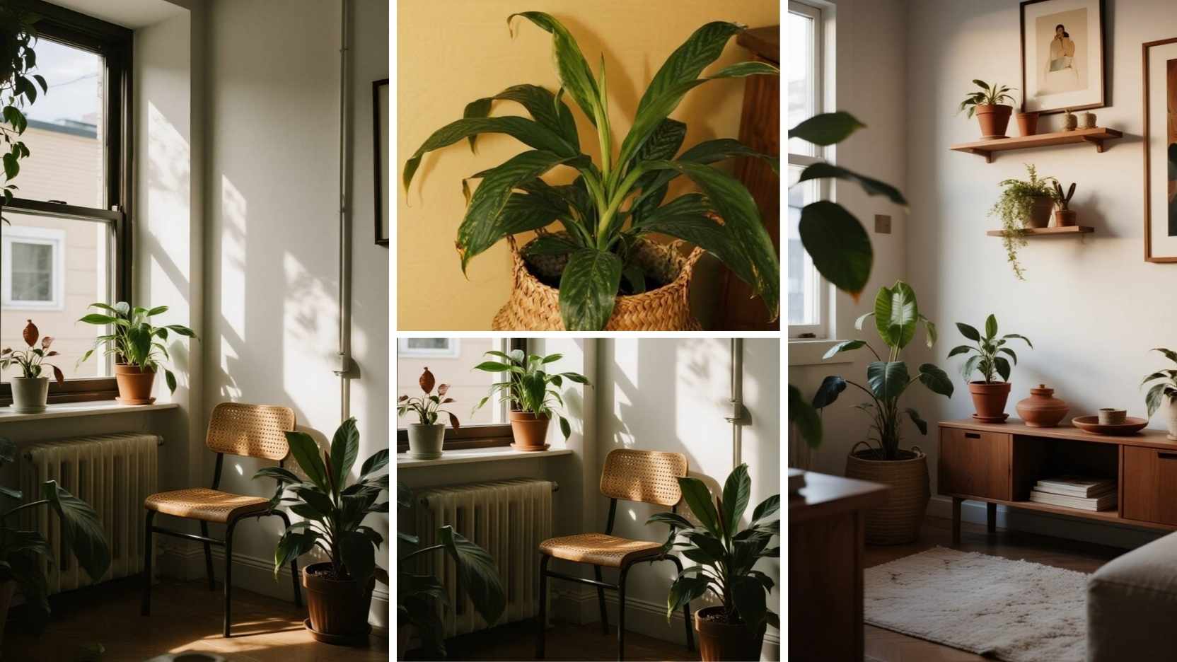
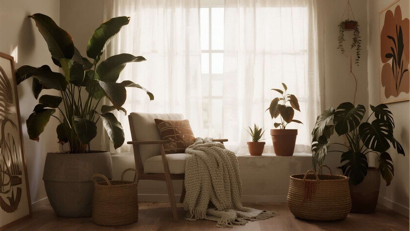
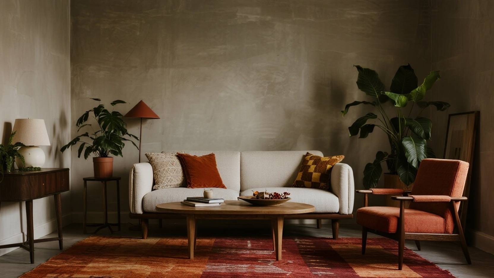
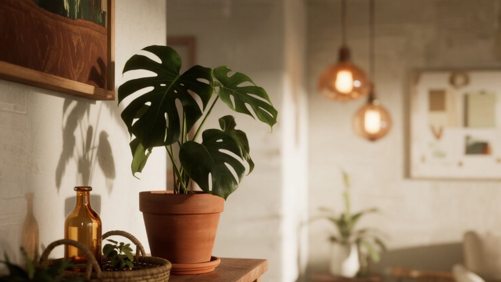
Step 1: Choose One Warm Base Tone (Terracotta Wins Fast) 🧡
A warm base tone works because our brains read it as cozy—similar to how candlelight and autumn colors feel calming compared to stark white and cool gray. Terracotta is an easy win since it naturally complements most plant greens, and it hides small scuffs and soil marks better than bright white pots. To keep it looking intentional (not random), repeat the base tone at least three times in the room: for example one terracotta pot, one rust-toned basket, and one warm brown tray.

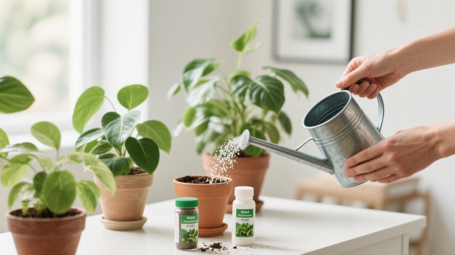
Step 2: Add One Metal Accent (Brass/Gold = Instant “Styled”) ✨
Metal accents act like “jewelry” for a plant corner—small touches that make the whole setup look finished without adding clutter. Pick one metal family (brass or gold) and stick with it, because mixing multiple metals can make a small space feel visually noisy. Easy ways to add it: a brass watering can, a gold-toned plant mister, a thin metallic picture frame beside the plants, or a small brass tray that collects a candle and matches your warm palette.

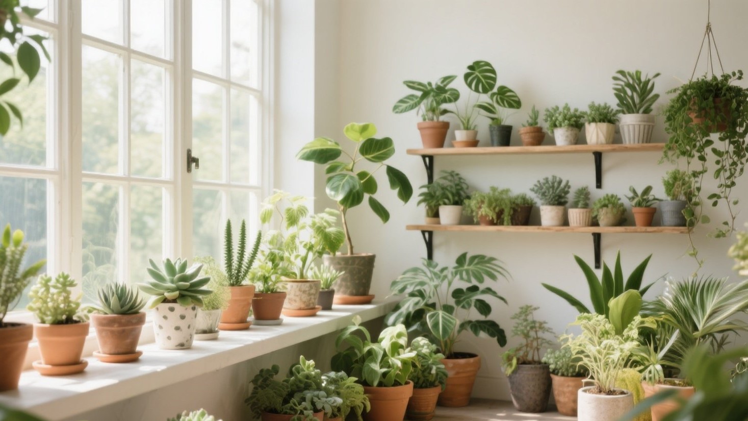
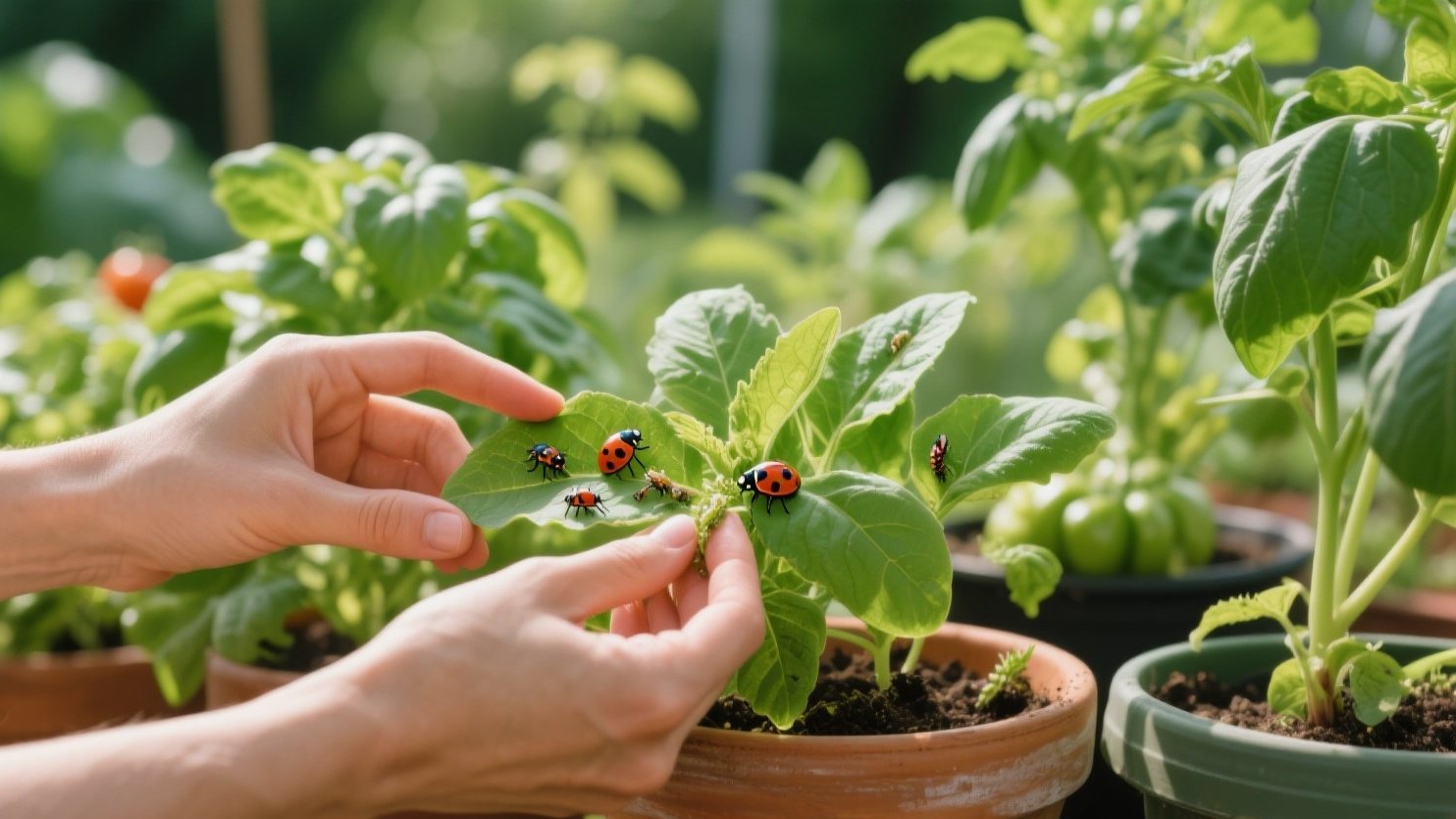
Step 3: Let Deep Greens Be the “Neutral” (How to Balance Light + Dark) 🌿
Green is the one color you can repeat endlessly without it feeling repetitive, as long as you balance leaf size and plant height like a layered outfit. Mix one tall plant (like a rubber plant or dracaena shape), one medium bushy plant, and one trailing vine so the greens look designed instead of “just placed there.” If your room has low light, avoid relying on lots of small plants—fewer, larger silhouettes look cleaner and typically feel calmer to maintain.

Quick Wins: Swap Pot Colors, Add Baskets, Use Warm Bulbs Near Plants 💡🧺
You can transform the mood of a space in under an hour by changing only what surrounds the plants, not the plants themselves. Swap mismatched pots into terracotta (or warm brown), hide nursery pots inside woven baskets, and group plants in odd numbers (3 or 5) so the arrangement feels naturally styled. For lighting, use warm bulbs near your plant corner to soften the whole room—warm light makes greens feel richer and makes terracotta and amber tones glow instead of looking dull.
Conclusion: A Cozy Palette That Always Looks Intentional 🤎
When you commit to one warm base, one metal accent, and let green behave like a neutral, your plant corner stops looking like scattered items and starts reading like a designed space. The best part is how “forgiving” this palette is—terracotta, amber glass, and deep greens still look cohesive even if you add new plants later. Keep repeating the same tones in small ways, and your room will feel warmer, calmer, and more welcoming with almost zero effort.