Introduction
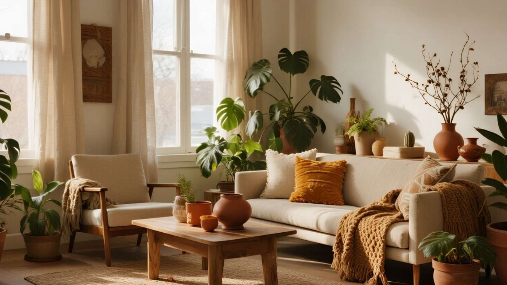
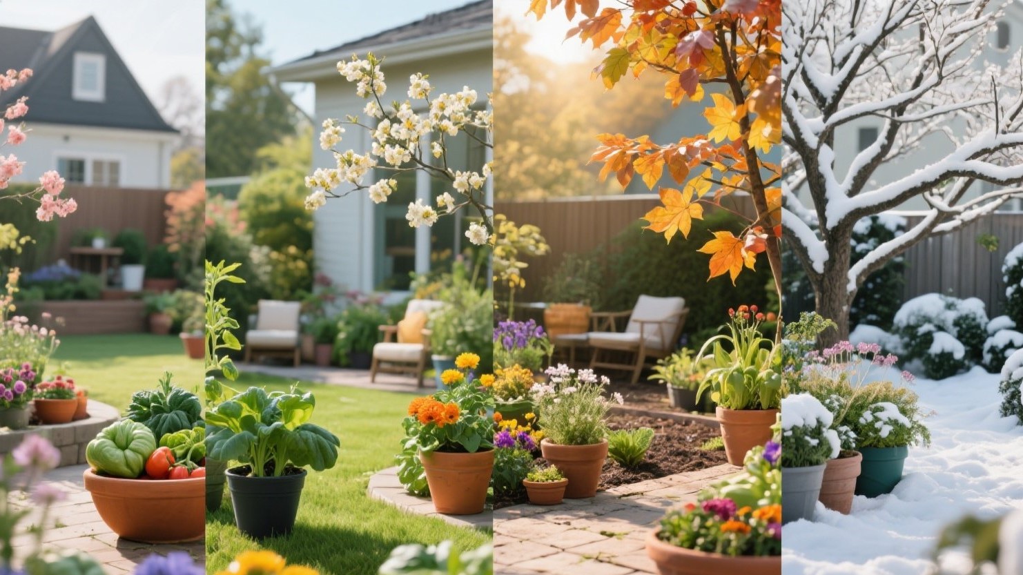
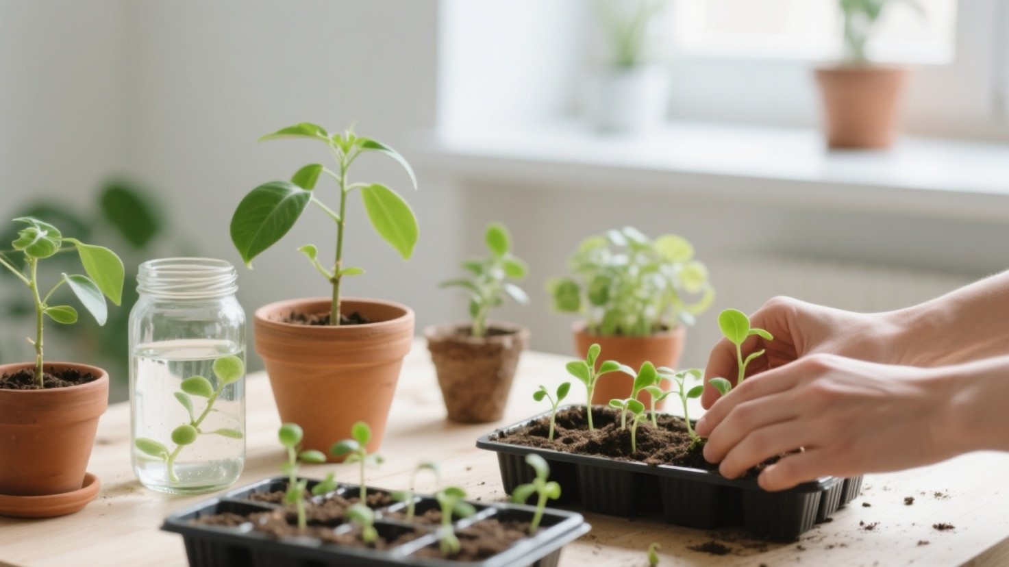
Spring styling reads best on camera when you add fresh greens, soft color, and height changes that lead the eye. Houseplants provide organic movement while faux florals lock in bloom color that won’t wilt mid-shoot. Think of your room like a set: every surface should have one clear focal and one supporting element. 📸✨
This guide gives you three plant-plus-placement formulas that photograph beautifully: a tall + trailing combo, a low bowl centerpiece, and targeted faux in tricky spots. We’ll also cover watering and maintenance cheats so your greens stay perky, and a vase/planter palette that telegraphs “spring” instantly. Use these as plug-and-play recipes for shelves, consoles, and coffee tables. 🌿🪴
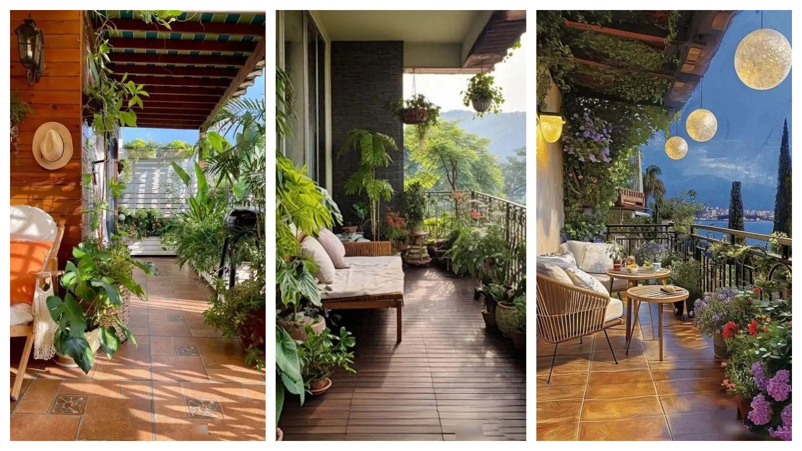
Tall + Trailing Combo (Shelf & Console Styling) 🌿➕🌱

Pair a tall, upright plant with a cascading friend to create a camera-friendly “L-shape” that frames your shot. On consoles, try olive tree or rubber plant as the anchor, with pothos or philodendron micans spilling from a raised planter. On shelves, place a medium ficus or dracaena on the base and let a trailing ivy drape from an upper shelf for depth. 📚🌿
For maximum impact, offset the tall piece to the left or right third of the frame and let the trailer pull the eye across. Use a riser or stacked books to lift the trailing pot two to three inches above its neighbors for separation. Leave negative space around the foliage tips so the greenery reads crisp, not cluttered. 🎯✨
Low Bowl Centerpiece (Coffee Table Focus) 🍃🏺

A low, wide bowl keeps sightlines clean while delivering a lush focal that looks great from overhead and sofa height. Start with a shallow ceramic bowl, mound preserved moss, and nestle a tight cluster of faux ranunculus, anemone, or tulips in spring tones. Add two small “supporting actors”: a candle and a slim book stack for scale. ☕📖
Keep the overall height under 6 inches so the arrangement doesn’t block faces on the couch. Choose three hues max—think butter yellow, blush, and soft white—so the palette reads intentional on camera. Rotate the bowl so the fullest bloom faces the lens, then shoot at 45° and straight-down for variety. 🎥🌼
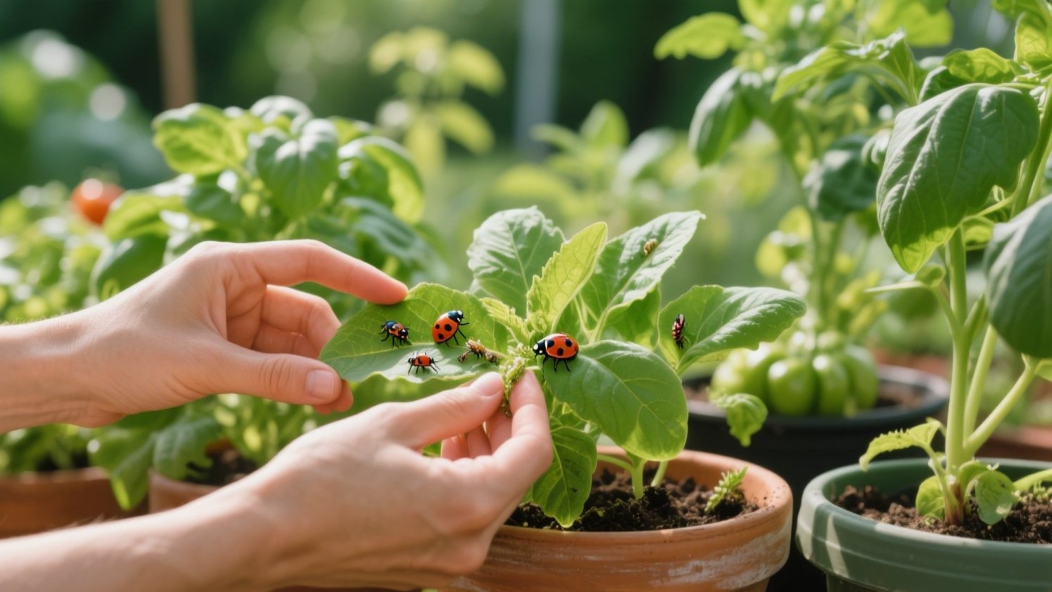
“Faux Where It Counts” (Entry & Dark Corners) 🌸💡

Use faux stems in spots with tough light or airflow—entries that draft, corridors, and shadowy corners. Tall faux cherry blossom, pear blossom, or magnolia in a slender cylinder instantly signals season at the door. In a dark corner, place a floor vase with faux eucalyptus branches for volume that never droops. 🚪🌿
Blend realism with restraint: three to five stems are plenty when they’re tall and airy. Add one small real plant nearby (ZZ plant or snake plant) so the eye “believes” the greenery. Dust weekly with a microfiber cloth and rotate stems quarterly to refresh the silhouette. 🧼🕰️
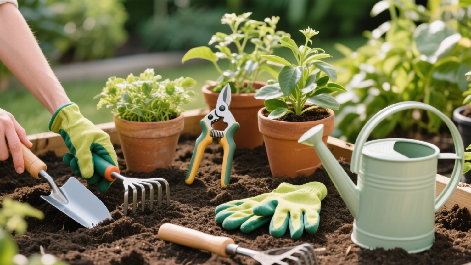
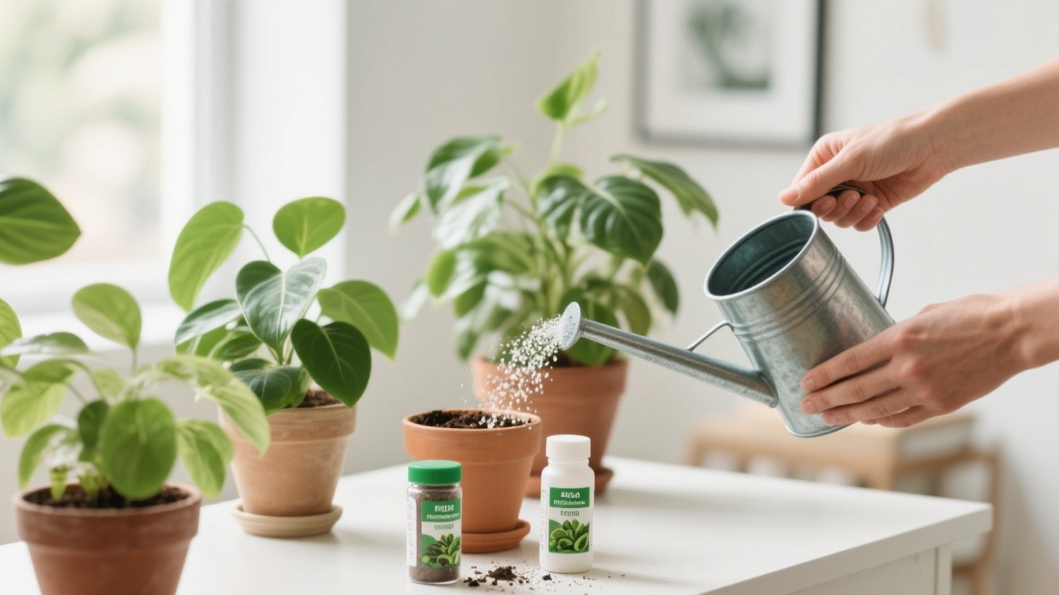
Watering & Maintenance Cheats (Keep It Fresh) 💧🧰

Beat droop with simple systems that don’t show on camera. Self-watering inserts or cachepots keep soil evenly moist without saucer spills, and capillary mats work under grouped pots. A basic moisture meter removes guesswork and prevents overwatering—your biggest on-screen enemy. 🪴✅
Stage day tip: water 24 hours before shooting so leaves are hydrated and surfaces stay dry. Wipe foliage with a damp cloth for a soft sheen; remove yellowed leaves for a cleaner profile. For trailing vines, pinch tips lightly to encourage fullness where the camera sees it most. ✂️✨
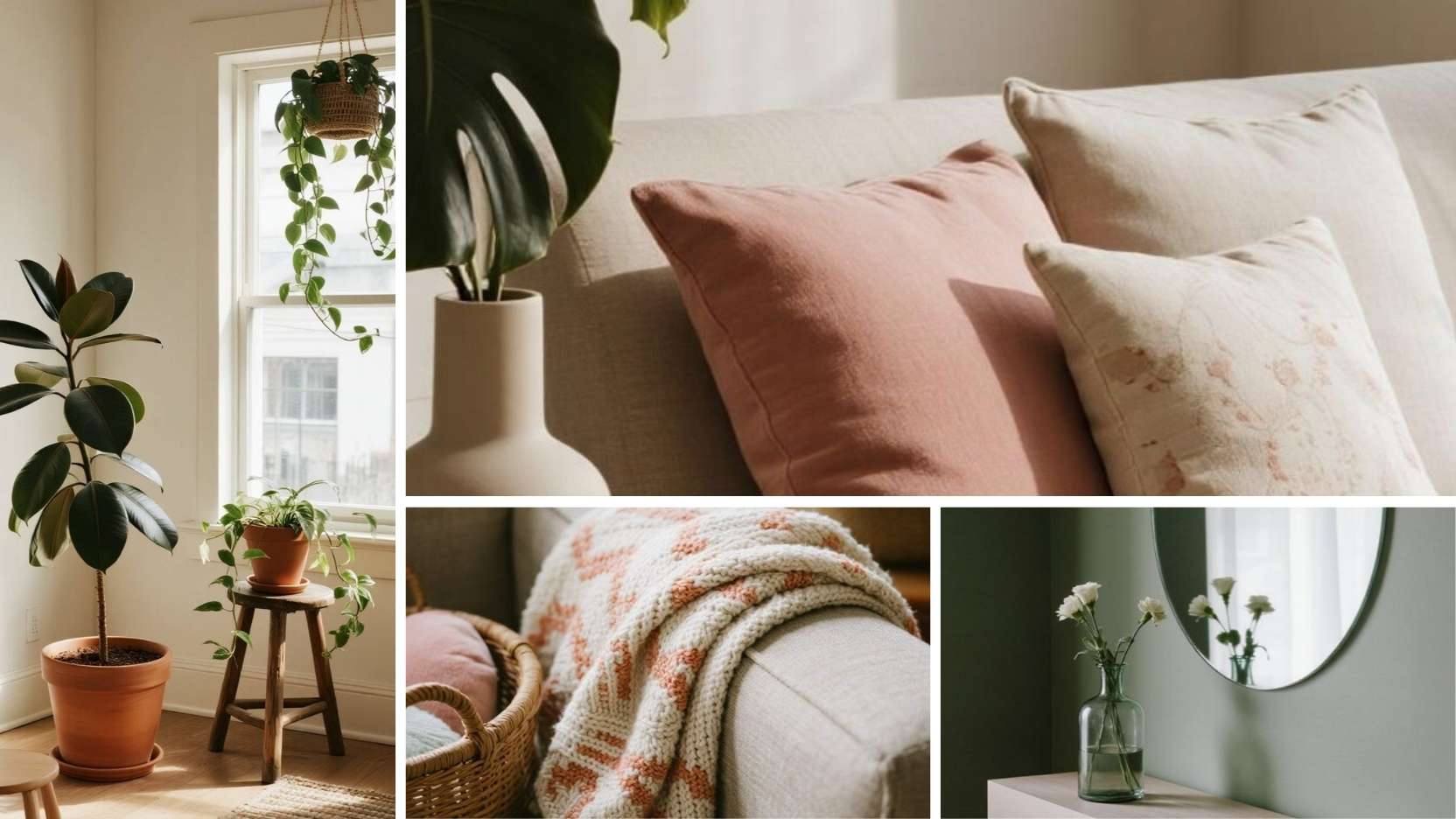
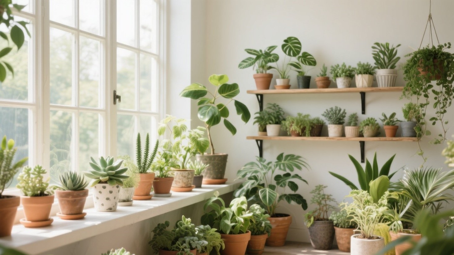
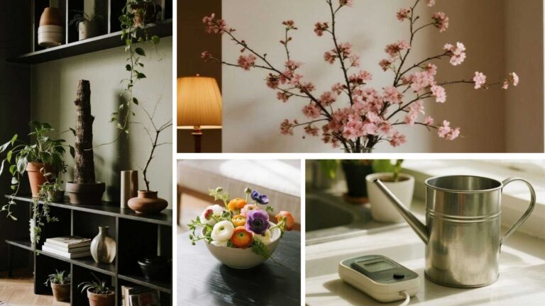
Vase & Planter Palette (Spring-Forward Colors) 🎨🪴

Spring reads best in soft neutrals with a whisper of pastel: matte white, speckled cream, sage, blush, and pale sky. Mix two textures—smooth and ribbed—and keep finishes mostly matte to avoid glare. Use one accent color per surface so your greens remain the hero. 🧺🌿
On shelves, work a 60/30/10 ratio: 60% light neutral vessels, 30% pastel, 10% glass. On consoles, anchor with a large neutral planter and add a single colored vase for repeatable rhythm. For coffee tables, contrast a pale bowl with deeper moss to make blooms pop without oversaturating the frame. 📏🖼️
Quick Pairing Recipes 📋✨
-
Shelf: Rubber plant (tall) + philodendron micans (trailing); matte cream planter + ribbed blush pot.
-
Console: Olive tree (tall) + pothos in footed pedestal; speckled cream planter + sage vase.
-
Coffee Table: Low bowl with moss + faux ranunculus cluster; add candle + book trio.
Conclusion
Spring styling isn’t about buying everything new—it’s about smart pairings, clean lines, and a color story that photographs well. Use tall-plus-trailing for dynamic corners, low bowls for calm tabletops, and strategic faux where real plants struggle. Maintain with simple watering systems and a matte, pastel-friendly vessel palette. 🌷🏡
With these formulas, your room will look fresh to the eye and flawless on camera. Swap stems seasonally, rotate vessels, and keep surfaces breathable for that editorial finish. Green beats gray every time—especially when the lens is watching. 📸🍃